Tuesday, December 15, 2015

OBJECT to MARK part two

Well...  
I made it home. 
Instead of sitting right down and working on the Mac armed with my ideas, tips, techniques, advice... 
I stitched.  Basket weave. Silk threads. A simple project that is colorful and one that I am stitching "in hand." Not on stretcher bars.

Tuesday. I started again. I reviewed my game plan and dove right into Illustrator. I made 4 art boards! and downloaded and exported 3 images. 1. The red scissors  2. The final sketched heart and scissors and  3. The opened black scissors.  
SUCCESS!!!!!!!!!!!!!!!!!!!

I rocked! I used the hollow white arrow to manipulate ellipses and circles into swirly, twirly spirals. I erased with the eraser tool. I practiced with the points and thickness, the strokes, even the fonts!!
Then.. I used the PENCIL tool!! At first my designs were uneven and .. let's say.. NOT recognizeable.. but after manipulating and mouse-ing I made swirls and spirals, twirls, and zigzaggy lines!!

My confidence grew and I realized.. That when I know the software and how to use the tools of Design.. 
I  ROCK!!


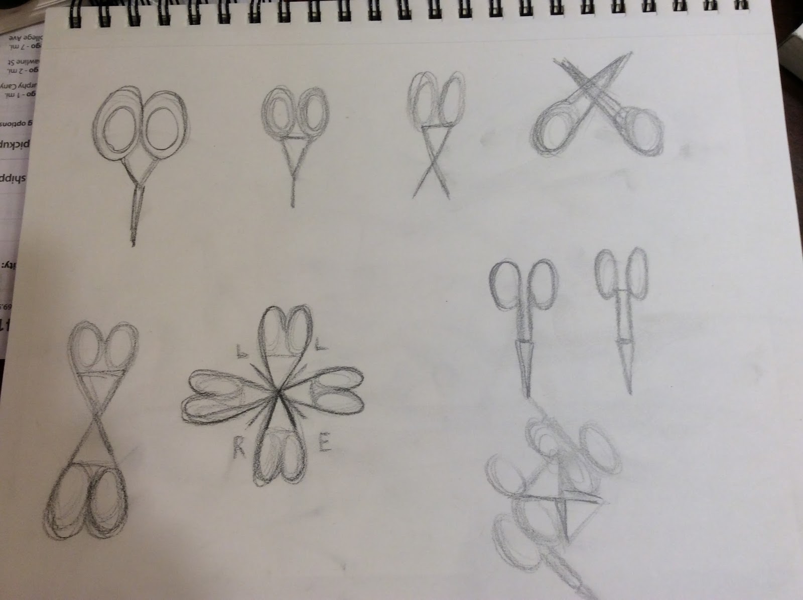
Three pages of different designs of SCISSORS and hearts!! 
First two boards:  
LEFT:  My first design. I love it. It is Abstract and I am even thinking that I might like to print it out and stitch it into a Needlepoint project. It could be put onto a box that can hold gadgets and stitching tools.  Or even stitched into a small fob to put on my favorite scissors!!!
RIGHT: The scissors became butterflys! and my FAVORITE design is the ones with the L and the needle.. I actually "made" a needle!! I love the brushy look of it and the simple image.. I can see this as a logo or on my calling card with my info. The font is Herrington. I fiddled with opacity and put an E on top of the L. I was thinking that it would be Cool! to write out ROCCOFORTE with a smaller point size and 75% opacity  and then write out LISA EDDO in a larger point size and black on top of my last name..
Oh the ideas!!!!

Third board and an Idea Board


LEFT board is my GOLD. the positive/negative logo is looking at me and whispering ideas. I LOVE the light swirly center and the delicateness of the finger holes. 
The RIGHT board is just ideas and extras.. images that I like and with work can be made into fun designs.  I even signed it as 
L heart E!  it looks like LOVE and it is my design and my signature that I used when I cross stitched. 

This is it my peeps.  
My Last assignment in ArtG100 Basic Graphic Design. 
Just like my Great Minds project in Design History.. I ended STRONG!  
I started at neutral in the beginning, excited, then I quickly moved into overwhelm mode. I wanted to quit. YES, QUIT! but I loved it so, I listened to a friend when he said, Everybody has a difficult time in the beginning learning something new. I am  techy, I have even built my own computer, and I would be overwhelmed in learning new software. You can do it Lisa, I know you can. 
I persevered,  and I learned.   
Next semester..  DIGITAL MEDIA  Learning Photoshop, Illustrator, and InDesign.  I talked to the teacher and told her that I would enroll and IF it was closed before I could register, would she ADD me. I enrolled a few weeks ago and Friday she asked if I was enrolled in the class for it was closed. I said YES, and she said that she is looking forward to working with me in class!! 
She remembered me :)

I posted it to my Homework Blog,  sdccdesign100LisaEddo@blogspot.com 

So, OFFICIALLY, I am out of class and on my way.. 
I LOVE BEING 
A Student of Design     lisa


Monday, December 14, 2015

OBJECT to MARK assignment Part One.

Object to Mark assignment.  Part one...

This assignment is the most useful moving forward in the Graphic Design process.. 
It is the building block of how a Designer.. designs. 
First, the inspiration:


My embroidery scissors. The bottom red pair is from France, Bodin. I purchased them in Victoria, Canada, BC. They are 2.5" and have a matte, satiny finish.. my favorite. Sharp and a great hand feel, plus they are petite and fun to use!
The black ones.. I bought in Julian, California on a whim.  2.75" long, matte black, sharp! and I liked the retro packaging.
I stitch, for those who don't know me. I am an Artist with Thread. 
I LOVE the hand feel of thread and yarn, the colors, 
the geometrics, the thought process, the women I meet in this genre, Everything.. HEART!!!!
Cross stitch, Needlepoint, Crochet, some knitting, needle and thread. My Nona [ Italian for Grandmother ] taught me to embroider when I was young.  She was a seamstress in Montebeluna, Italy where she was born and lived until she moved to America with her husband and her brother in her early 20's. She sewed couture at many design houses and designed and sewed her own trousseau and wardrobe.  She taught me to sew a French seam and everything else with a needle and thread. I don't even remember learning nor when I didn't know how. We started embroidering and crocheting edges on pillowcases.. The others came after when I realized that I hate embroidery.. another story! 
When I was young, I would sit by her elbow and sew, stitch, and sometimes draw and design clothes and accessories for me and my dolls.  Often, we would pray the Rosary in Italian and play "Remember When." I love that game. " I remember when.." or "Remember when?" 
SKETCHING THE DESIGN came next. 


Oh My!  He told us that we can also use tracing paper over the photo to sketch out the positive and negative spaces. I skipped that step, but now I think that I may try it for the next project.

I can SKETCH! I can GESTURE!!  no fear, no intrepidation,  no panic, and no first thought of "I can't draw very good and it won't be very good and it certainly won't LOOK like I want it to look."
Thanks to Drawing 1 WITH the very talented, Professor Wayne Hulgin at San Diego City College [ greatest serendipitous story.. EVER..] I sketched.. What I wanted and How I wanted it to be!!! With confidence in my talent and ability.. 
.. pause for a moment for the realization..."
Final sketch. There were several others that I liked in my sketches, but this one.. I liked best of all.
THEN onto Illustrator..  
FRUSTRATION level RED  
and this is what came out of it.. 

NOT HAPPY..  AT ALL!
I do like the "bandage heart" made up of rounded rectangles, circles, and a triangle. I am thinking that with a little tweaking and manipulating.. It would make a good Needlepoint design.  An ornament, a coaster, even a round purse. Basketweave or a selection of stitches in each section with a dark brown 898 DMC outline or just collaged next to each other.  

Monday's class was a Wall Critique.  We printed out our project, and put it up for the class to critique. It wasn't as bad as I thought it would be, lots of tips, ideas, techniques, advice, and one Pearl of Wisdom, Sean said to me.. "Don't do it all. Edit. You are trying to get EVERYTHING in there, great idea, just scale back."

Last day of class. Project needs to be refined and FINAL image posted to Blog before midnight Wednesday.  For people who need help.. Wednesday is the last day of class. 

Bittersweet ending. As I drove home I realized that my first semester as a Graphic Design Major is almost behind me.  
After this assignment.. I really am on my way.. 
almost full stream ahead as 
A Student of Design.... Lisa


Monday, December 7, 2015

Great Minds Project Milton Glaser

Great Minds Project..   Graphic Designer and Fine Artist   Milton Glaser

I posted this to my Design 100 Blog.. but to be honest peeps..  Just to excited to contain it ONLY to that blog..
I am so excited about this spread.  i have come a long way Baby since the first day and I am just over the Moon about it.

First two pages.  Cover and first page.


I am excited about the layout.  It actually came to me as I was driving and I jotted and sketched my idea in between lights.. and there were quite a few!!!  Since my Artists and Designers class and my Drawing 1 class where we HAD to keep a Sketchbook for a grade, I have kept one in my purse and a cute pen.  I am actually filling it up with ideas, sketches, storylines, etc.   
I like the STRATHMORE  SKETCH  book 5.5 X8.5   70 pages  Green Cover. 
 Second page  and third page    Iconic work and WHY I chose Milton Glaser for my Great Minds project
Fourth page and fifth page   Fine Art work and Quotes 
I can relate to MANY of these quotes, but my favorite by far, especially now is.. 
DRAWING IS HOW I THINK.. 

Sixth and final page  Bibliography
Here it is.. The man that spoke to me, through a film, in a stadium room, all by myself and started me along this wonderful, exasperating, fulfilling, and wild ride.  

He ROCKED my world and now, finally, I am.. 
a Student of Design..  Lisa


Wednesday, December 2, 2015

My Favorite project in PHOTOSHOP

Photoshop.. yes, I have a favorite project in Photoshop.
I really liked this project.
We downloaded black shapes that we cut out of construction paper and exported
the images to PhotoShop. After watching a very informative beginning video made by Rafael Lopez, we started manipulating shapes, colors, layers, opacity, transparency, and using the magic wand.
Do I enjoy PhotoShop? NO
Will I use it again?  Yes, it has many useful tools, you could say I like the PARTS, not the WHOLE.

Today.. I am .. A STUDENT OF DESIGN..   Lisa

Tuesday, December 1, 2015

I ENJOYED ORANGE.. T H I S M U C H!!!

I enjoyed ORANGE so much..

That it appeared in TWO of my assignments..  Grids & Modularity + Patterning

GRIDS   Complimentary Orange and Blue

AND... Patterns / Patterning 

The two Oranges are actually my mix of COLORS!!  

Color.. will always be a good thing for this..   A STUDENT OF DESIGN.. Lisa


SUNSET ORANGE part B

For Part B.. We were to take the color and give it an Emotional Name.. think OPI nail polish colors..

I chose my color and named it Sunset Orange.  My emotional pull towards this color has come from my car.  It is a 2005 Chevrolet Corvette. I bought it used in January 2013 in Atlanta, Georgia at a Car Lot called Corvettes.Com.  I bought him, shipped him home and he arrived on Valentine's Day.
I named him the Southern Gentleman. His official color is...
Daytona Sunset Orange Metallic.


I have always been partial to RED  You could say it has been my signature color after Blue, of course.  Now, I am still a RED girl, my hair is red too! But, now I am partial to the complimentary of Blue, and that is ORANGE.


I had a GRAND time researching the Emotion and the random trivial facts about this color. I don't think that I will ever look at a Clown's hair again with out knowing that it has it's beginnings from Bacchus!! Ritual madness and ecstasy!! ALSO.. the Golden Gate Bridge is ORANGE, painted that color because it is a highly visible color in the FOG!!
I even HAD to include a quote from my favorite Artist.. VanGogh.
There is no Orange without Blue..  

And this post is why I LOVE BEING.. A STUDENT OF DESIGN
Lisa

ORANGE. SUNSET ORANGE actually..

Yes.. Sunset Orange..

Week 7 taught us Color and its Meanings and Messages.
First, we attempted, in Adobe Illustrator.. Color Swatches.

For Part A.. we downloaded images in a wide variety of colors.. 

RED  PINK  YELLOW  BLUE  GREEN  PURPLE  NEUTRAL  BEIGE,  GREEN, or TAUPE
BLACK  and WHITE

and then we used the eyedropper tool to drop and place colors into the swatches. You can see my second progress a few posts back.. i enjoyed this process so much that I spent days and days with images and eydropping color upon color..  I will share my frivolity in the next few posts..

But first.. the assignment.. We were to select ONE color. Name it and post it with its CYMK and RGB color values.

I named them all.. Yes, I did :)  
From Left to Right:
Light Orange  Sunset Orange   Pumpkin Orange  Red Orange  Darkest Reddest Orange

I CHOSE.. Sunset Orange
CYMK    Cyan  10  Magenta  78  Yellow 100 and K [Blue] 22
RGB        Red 218   Green 91  Black 22

I knew I wanted to complete an Orange Part B so I searched and practiced on several Orange images
From Top to Bottom:  
Pumpkin Stem Green    Pumpkin Shadow    Medium Pumpkin    Light Pumpkin  Pumpkin Highlight  

This image is VanGogh's Study of an Orange..  I LOVE this Palette.  
I call it Van Gogh's Compliment   Colors Top to Bottom:
VanGogh Orange Highlight    VanGogh Orange Shadow  VanGogh Orange 
VanGogh Complimentary Blue  and VanGogh Blue Eyes

There are many other colors in this painting and in my Works in Progress, I have 20+ swatches that I am finding. In that file are two other Van Gogh paintings.. Starry Night and Haystacks.. 


Color is an integral part of my life, I think that is what I have always gravitated towards.. at one low point in my life, I even started a blog .. Beyond Beige.  
My hobbies have always been color based and color just sparkles for me.. I would not be surprised at all if these color palettes show up in my needlework, crochet, knitting, or just in my life.. 

for now I am ..   A [Colorful] Student of Design.. Lisa


COLOR Week 7

On Week 6 and 7 we explored COLOR.. yes.. my favorite week and Subject..

We painted a grayscale..
I have painted in grayscale many times and have sketched it also.. Technically, a Gray Scale helps the artist determined the values of gray between Black and White.  Think.. Black and White photography and movies.  I have discovered through my attempts, that to really make your artwork POP! it needs the blackest black and the whitest white to work.. to be complete. 
Here is my attempt at the GrayScale Ladder

I am not 100% happy with it.. there is too much of a jump between WHITE and #2 .. For my level of expertise.. it is a good attempt.