TyPoGrAPhY & a chat
https://en.wikipedia.org/wiki/Typography
Yes! I am back. It has been a long haul from the last post.
I didn't know if I would even be back, but, I dug deep, turned away from a few people, stood up...
AND
here I am.
Mondays and Wednesdays 2:20 to 5:30
Typography ArtG 106 Amy Becraft, professor
San Diego City College
It is my ONLY class this semester.
No Drawing, Painting, Ceramics, Illustration
Just Typography, all day, all week, all consuming.
Because, I have a JOB.
I am 1/2 owner of a CESSNA Service Station
{with my for-now husband... long story, different blog}
and I am the Office.
I like to call myself an Office of One because I am an Office of One. ME.
To be brutally honest... I am a passionate scatterbrain.
I find a project that I love and I want to jump in and consume myself in my Passion. BUT..
I take on too many projects and I get side tracked and start to lose focus.
After a few weeks, I realize that I am not a multi tasker, my work piles up, my productivity goes down, because I am spread too thin to focus on one project to the best of my ability and I start to get ... let's say...
not working up to my FULL potential.
Last semester, is a perfect example. I spread myself thin,
three classes and each one was a new subject, except Honors Drawing 2, but what was new is that we were building a portfolio with "finished" drawings and that was a new experience for me.
I was doing okay for the first few weeks and then too-much- to-handle happened within a few days: conflict with an angry acquaintance who used his frustration and honesty as a weapon; a mentor who took the gloves off this semester; late nights and early mornings; all combined with a slowly dissolving marriage; and it all side lined me and I dropped down to only one class.
Digital Media ArtG125 My first grade of a B.
I re-grouped. I am a Leo, and we Leos land on our feet.
When I hit the ground, I cried. I pouted. I even yelled, a bit.
I stood up.
Took the Summer semester off;
I cleaned, organized, worked, immersed myself in Art, Color, Design, and needlepoint.
I was even fortunate enough to attend an Art Walk tour of London and Stratford-upon-Avon for two glorious weeks
.
I came back inspired and ready to move forward... slowly...
During my travels, I learned a lot about love, people, passion, art, books, letters, architecture, food, and ME.
What I love; Who I love; and Why I am who I am.
This is me folks... no apologies;
I am back and ready to move forward as
A Student of Design once again,
Lisa xoxo
Wednesday, August 24, 2016
Monday, February 15, 2016
ARTG 125 Digintal Media Pen Project
Digital Media
What can I say? I love it, I tolerate it, I need it. Success and not so much success.
We have been working exclusively in Adobe Illustrator AI
We learned the difference between Raster and Vector. How to Zip and Archive and Compress files. How to save, export, and download, files and images.
The difference between images that are imbedded and tag along.
Julie Warren, professor of Digital Media and Current Event Maven, is great. Her enthusiasm, her excitement, and her humor makes this class with all the dry information fun..
She even turned me on to Google News.. Trivia!!!!!
Here are a few of our past projects...
Draw 1: We learned about Illustrator. How to fill, shapes, symbols, How to click the up and down arrow to make the star symbol explode into a multi-pointed starburst! GPU setting makes a black and white coloring page! Command G makes a GROUP, like the house. and you can drag your house over to the SYMBOLS and create your own! FUN FUN FUN!! casa Lisa

Pen Tutorial: Not much to say.. still practicing, practicing, practicing, and practicing to perfect and master..
Did I say practice enough? probably not..

Mask Draw: We learned to draw a "hole" this mask has functioning eyeholes. The tassel was too exciting to make. I used strokes and brushes and made stars and shrunk them down. The gradient color was a pre-made, pre-set swatch, and the stars are a symbol. The cat print is made by ME. This is my version of an Italian Carnivale mask. The type you hold in front of your face. The yellow circles are beads that sway and click musically as you move and dance. Meow..

Pepper Draw: This project was designed to help us draw a Vector image realistically. We used Blend, Burst, Gradient, and the Eye dropper tools. We traced an embedded image on a template layer with the pen tool, and worked with layers. This was NOT my favorite project.. yet everything we used was my favorite. I think that I will embed another inspiring image and work with the tools on my own...
I am still a Student of Design.. and trying to follow the directions!
Lisa
TYPE PROTOTYPE Stumpy Line
E_1 Bitmap Type Prototype
This is my tabloid:
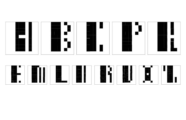 A B C P Q E M L R V X Z
I enjoyed this project so much that I completed my
Type Prototype Bitmap
I will call this Stumpy Line


This is it.. Enjoying being a Student of Design... Lisa
This is my tabloid:

I enjoyed this project so much that I completed my
Type Prototype Bitmap
I will call this Stumpy Line
Wednesday, February 3, 2016
ArtG 106 TYPOGRAPHY Monday and Wednesday
ArtG 106 Typography Monday and Wednesday 2:30-5:30
Amy Becraft
We are up and running now. Using InDesign for most of our projects..
Lots to learn, but its is fun and exciting.
I like to explain it like this:
It is like solving a puzzle. Problem solving, yet, creative and new.
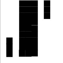
The first project E1_ Eddo
We were given the task of creating a prototype for
a new bitmap typeface.
In class, we made a 3" 10 x10 unit square using InDesign.
Next.. squares with a dark fill. Amy explained that when printing, Printer Black sometimes prints more gray and recommended that we make our own CYMK color..
which I did and named it Rich Black.
I took my creating to graph paper and pencil and pen.
I doodled out several and enjoyed the process. Then on to the computer with confidence this time. We made a Master and pages and pages of our Bitmap typeface.. A B C P and Q. After creating the the typeface I Grouped [Command G] Copy [Command C] opened the Tabloid handout and Pasted [File and paste] it and sized-to-fit into the Tabloid. Amy had downloaded a Tabloid template for us to use after showing us a class demonstration,
One day the class printed out our tabloids, pinned them up, and we critiqued our work.
It always amazes me when my work is critiqued by my peers. Often the critiques point out what I cannot see and gives me inspiration and ideas to change, tweak, and if necessary, to start again.
 This is my second attempt. My first attempt had "heart" as the opening and it did not convey.. so this is my second attempt.
Still.. A Student of Design.. alphabet style :) lisa
Amy Becraft
We are up and running now. Using InDesign for most of our projects..
Lots to learn, but its is fun and exciting.
I like to explain it like this:
It is like solving a puzzle. Problem solving, yet, creative and new.
The first project E1_ Eddo
We were given the task of creating a prototype for
a new bitmap typeface.
In class, we made a 3" 10 x10 unit square using InDesign.
Next.. squares with a dark fill. Amy explained that when printing, Printer Black sometimes prints more gray and recommended that we make our own CYMK color..
which I did and named it Rich Black.
I took my creating to graph paper and pencil and pen.
I doodled out several and enjoyed the process. Then on to the computer with confidence this time. We made a Master and pages and pages of our Bitmap typeface.. A B C P and Q. After creating the the typeface I Grouped [Command G] Copy [Command C] opened the Tabloid handout and Pasted [File and paste] it and sized-to-fit into the Tabloid. Amy had downloaded a Tabloid template for us to use after showing us a class demonstration,
One day the class printed out our tabloids, pinned them up, and we critiqued our work.
It always amazes me when my work is critiqued by my peers. Often the critiques point out what I cannot see and gives me inspiration and ideas to change, tweak, and if necessary, to start again.

Still.. A Student of Design.. alphabet style :) lisa
Friday, January 22, 2016
SKETCH BOOKS
Sketch books
Today is all about Sketch books.

I have learned from my classes, online and in person, that a sketch book is a very important tool for an Artist, Designer, etc.

I have learned from my classes, online and in person, that a sketch book is a very important tool for an Artist, Designer, etc.
As Milton Glaser says, "Drawing is the way I think" and if you are serious about Art and Design, a sketchbook is the #1 tool for you.
Long time ago, I didn't quite believe it. Sure, I had many, many sketchbooks that I had doodled in, collected snippets, wrote quotes and notes, and just contained the ephemera of my life. Many of them were half-filled, but all of them were artistic, they had pretty covers and were fun to just look at and carry around. Nothing too serious.
Long time ago, I didn't quite believe it. Sure, I had many, many sketchbooks that I had doodled in, collected snippets, wrote quotes and notes, and just contained the ephemera of my life. Many of them were half-filled, but all of them were artistic, they had pretty covers and were fun to just look at and carry around. Nothing too serious.
In my Artist and Designers class, Fall 2014, we were graded on our Sketchbook. The teachers gave us a criteria of what they expected and it was worth a good portion of our grade.
I panicked.
I don't "use" my journal/sketchbook on a regular basis.. what am I going to do now?
I don't "use" my journal/sketchbook on a regular basis.. what am I going to do now?
To make it fun and authentic, I purchased a Strathmore Drawing sketchbook and a fun Sepia pen to write notes. I had big plans for the cover, but nothing worked out except the cork backing on the book. I liked the cork, it made it sturdy and didn't slip around when I was writing.
I really got into keeping this Journal/Sketchbook! I wrote the notes from the class, snippets of conversations I overheard, quotes from the Artists and Designers portrayed, I researched them and wrote my interpretation of their work, blog lists, websites, and doodles.
I really got into keeping this Journal/Sketchbook! I wrote the notes from the class, snippets of conversations I overheard, quotes from the Artists and Designers portrayed, I researched them and wrote my interpretation of their work, blog lists, websites, and doodles.
One memorable conversation that I wrote about was a question asked by the student who sat behind me..
"If you could have a Super Power.. What would it be? And Why?" The whole class started answering and their energy and thought process provoked and inspired me and I wrote pages about that subject alone.
Mine? My Super Power would be INVINCIBILITY.
Why? Because if you could do, go, and be anything and anybody without the fear of Death or injury.. what wouldn't you do, where wouldn't you go, and who wouldn't you be!!
Another quote I wrote several times and even expanded it with images and quotes in different languages was: Children of the World. Wayne Hulgin, the co-teacher who taught the "Artist" section of the Artists and Designers, would announce that greeting often as he breezed in before class. That was his greeting and it intrigued me, so I researched and noted it all in my sketchbook with questions answering the What, Why, Who, and How.
I received full credit for my sketchbook, and when he returned them he said we all had done well.. I was hoping for more of an individual critique and maybe a sketch, doodle, or quote added inside.. but all and all it was a good exercise and now I have several and I actually USE them!!!
Now, I am in Sketchbook Skool and a Sketchbook is needed.
So, I chose a Mixed Media
 It has Coloring Pages.. that seems to be "the Rage"
Coloring pages for adults.
I also liked the Thanks, Merci, and Gracias *heart*

I am also enrolled in Drawing 2!! I have waited patiently for 3 or 4 semesters for it to be offered and taught by Professor Wayne Hulgin, Art Teacher Extraordinaire and his very own self..
He is the Art Teacher I asked and prayed for to teach me the Basics of Drawing on the steps of VilleFranche.
More on him later.. It is quite the Serendipitous Story [if I do say so myself ]
I will probably, most definitely need a Sketchbook because he requested one for Drawing 1 so I will probably use this one..
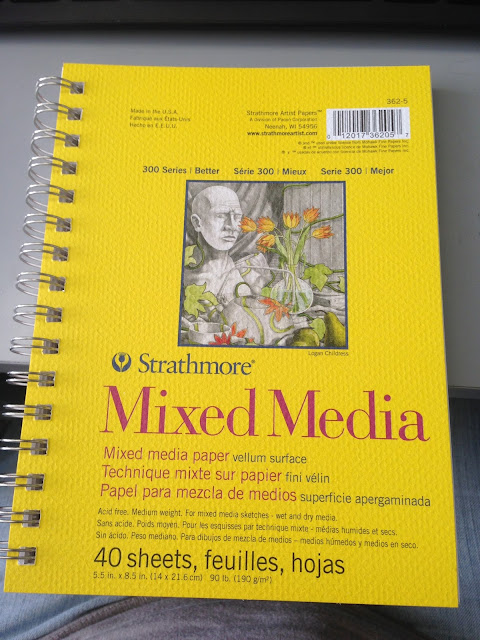
This is small 5.5x8.5 and I may consider a 9x12, but i think that I will stay with the Mixed Media. We will be using NuPastels, so
I may consider a paper with more "tooth." I am sure he will let us know..
I will also be enrolled in two Graphic Design classes.
Typography and Digital Media. I will need a book to write notes

This is my "go to" Sketchbook for Class notes. They are the perfect size 5.5x8.5 and ink, roller ball or Micron pens just glide over the pages.
I like Strathmore paper, it is a bit expensive, but Michaels offers coupons. 40% off an item, or sometimes, your whole purchase!
I prefer the recycled paper because it is not WHITE WHITE. It is not quite ecru, or Mother of Pearl, but is pleasing to my eye.

I am afraid you cannot tell exactly the color nor texture of the
[l to r] Books.. Canson XL Mix Media 7x10 98lb slightly toothy, thick, very white, [2nd choice] wet or dry medium
Strathmore Mixed Media 300 series vellum surface medium weight 90 lb 5.5x8.5 slick smooth surface eggshell white
wet and dry medium
Strathmore Sketch fine tooth surface 60 lb dry medium 5.5x8.5
That is my Sketchbooks and note taking books..
Starting soon.. I will be a
Student of Design Lisa
Subscribe to:
Comments (Atom)